EduUSA
EduUSA is a mobile-first MVP that helps prospective students quickly discover, compare, and evaluate universities in the United States. The goal was to reduce cognitive load during early exploration and make side-by-side comparison effortless.
My Role
UX/UI Designer, IA and key flows, component library, and accessibility.
Stack
Figma, Next.js, Tailwind, shadcn/ui, Framer Motion, Vercel
Team
2 UX/UI Designers
Timeline
2 Weeks
Problem Discovery
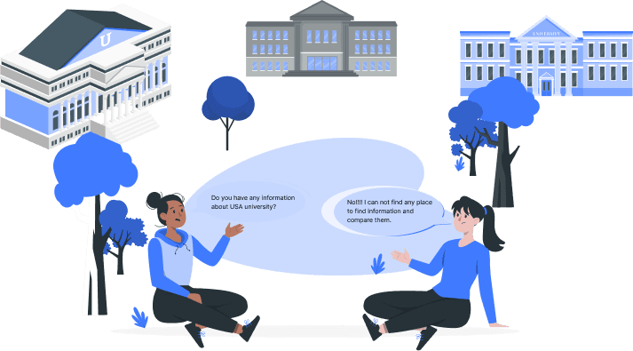
Students Struggle to Compare Universities Quickly and Confidently.
Students, especially international applicants, struggle to build a short list because information is scattered and interfaces are noisy. They need a clear path from discovery to comparison to taking action (apply or book an appointment).
Our Solution
A Calm, Mobile-First Experience for Fast, Confident Comparison.
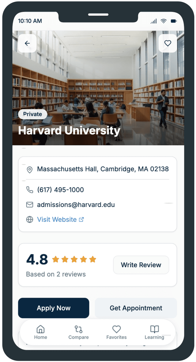
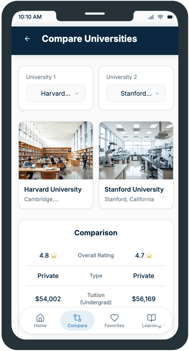
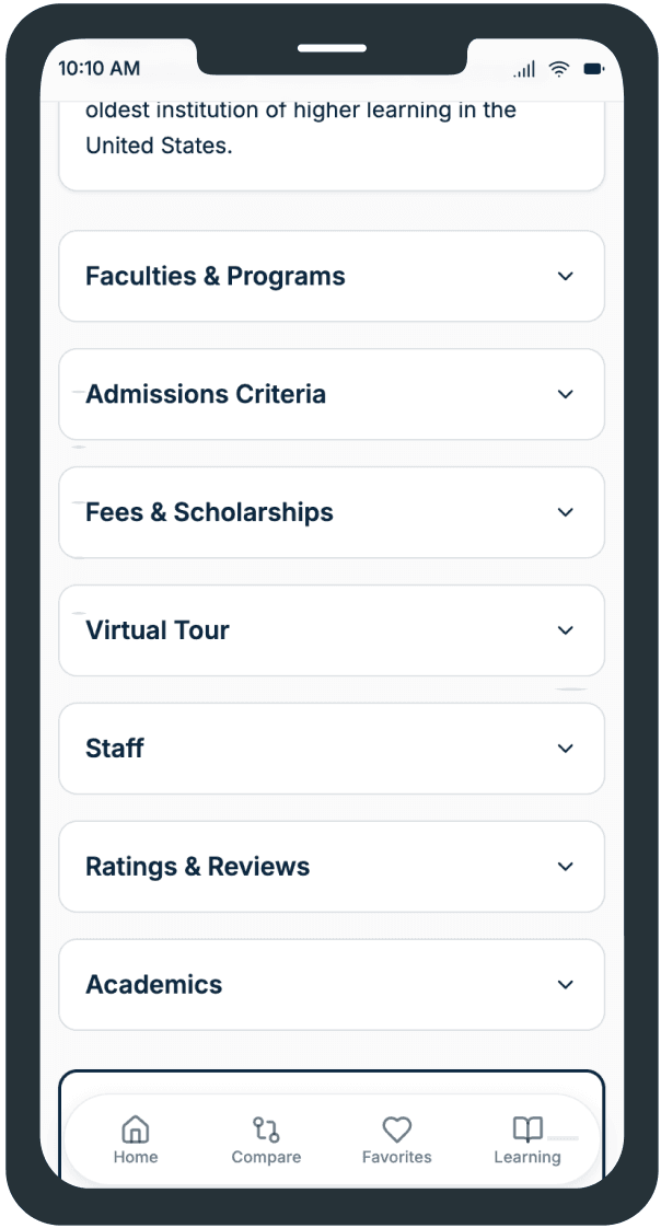
EduUSA introduces a simplified mobile experience that lets users search, filter, and compare universities in just a few steps. In addition to providing university information and application guidance, EduUSA also includes virtual campus tours. This feature allows users to explore universities visually and compare them directly in the app, without needing to search on Google or visit multiple websites. It creates a more engaging and informed decision-making experience for prospective students.
User Research
Through surveys and interviews with international students, we discovered key challenges in the university search and admission journey. Most users felt overwhelmed by scattered information, unclear comparisons, and lack of guidance in finding universities that match their academic and financial profiles. These insights helped us shape EduUSA as a simple, guided, and confident experience for choosing the right university.
Findings

1. Students struggle to find universities that match their goals.
“I don’t know which universities actually fit my grades, budget, or career plans. There are so many sites, and none really guide me clearly.”
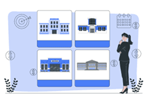
2. Comparing options feels confusing and time-consuming.
“Every site shows rankings or random lists, but I can’t easily compare tuition, scholarships, and admission criteria in one place.”
Insights
Lack of centralised, guided information makes the decision process overwhelming, reducing user trust and engagement.
Complex comparisons slow users down and increase dropout rates; simplifying key metrics on cards and tables builds clarity.
Usability Testing
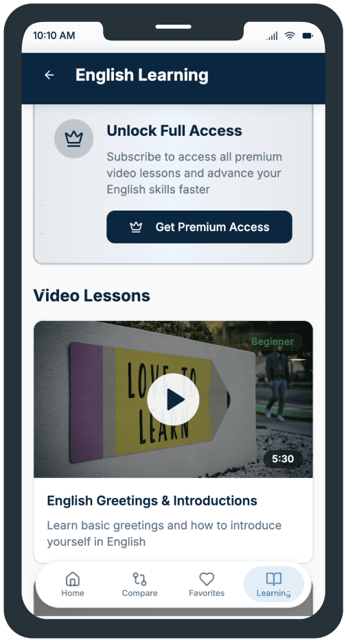
During usability testing, we observed that users often tried to access the Learning section directly from the bottom navigation rather than through the Menu. Based on this insight, we replaced the Profile tab with a direct Learning shortcut, improving accessibility and making educational content easier to discover.

High Fidelity
University Details | Learning

Impact (Early Signals)
The initial release showed a noticeable increase in engagement with university cards and detail buttons (example: +X%). During internal testing, the average navigation time to the comparison table dropped to under Y seconds, a promising indicator of improved efficiency. (Metrics will be updated after external validation.)
Learnings & Next Steps
Minimal cards and a clear comparison table reduce cognitive load, helping users make faster decisions. A guest-first approach lowers entry barriers, while transparent value messaging encourages account creation. Next steps include connecting to real university data, enabling preference storage, and running A/B tests to refine CTA clarity.


